When I first started experimenting with interior design, I found myself overwhelmed by color choices.
I’d pick a wall color I loved, then struggle to match furniture, textiles, and décor without making the room feel chaotic.
That’s when I discovered the 60-30-10 rule, a simple yet powerful guideline that instantly transformed my spaces.
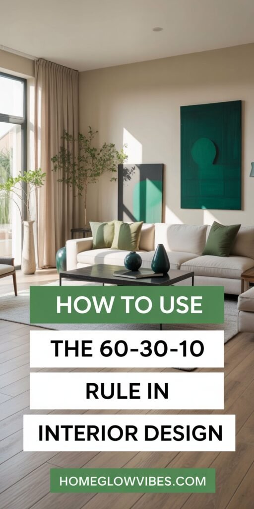
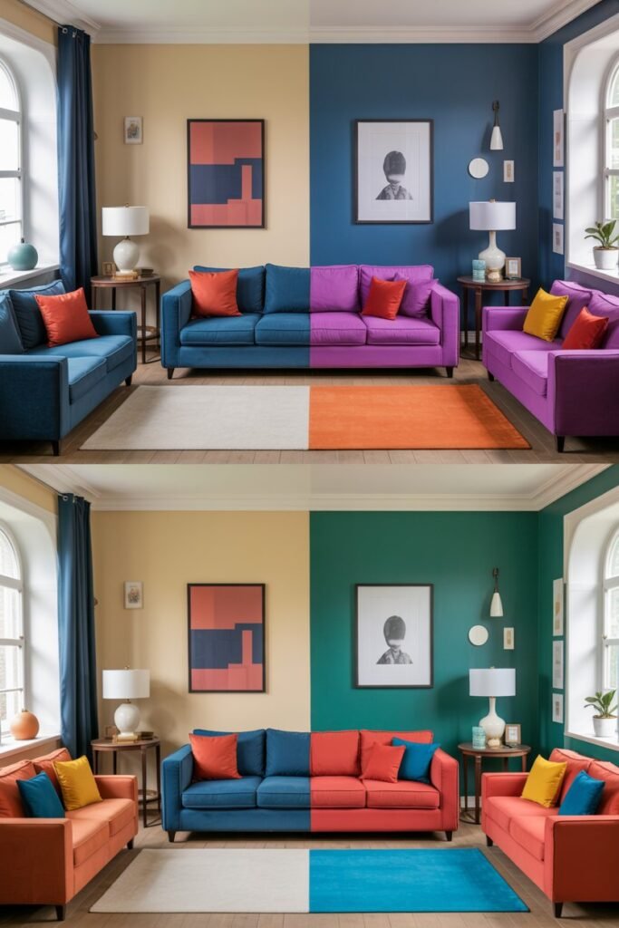
The 60-30-10 rule is all about balance and harmony. It’s a color distribution technique used by designers to create rooms that feel cohesive, elegant, and visually appealing.
The concept is straightforward: 60% of the room’s color comes from a dominant shade, 30% from a secondary color, and 10% from an accent color.
Yet, despite its simplicity, applying it effectively can make a room feel polished, professional, and stylish, even if you’re working with a limited budget or a mix of old and new pieces.
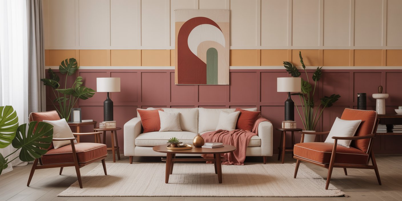
I began using this rule in my own home, starting with my living room. I painted the walls a soft warm gray (60%), added a darker charcoal sofa (30%), and brought in golden yellow pillows and small décor accents (10%).
The difference was remarkable — the space felt balanced, inviting, and intentionally designed. Guests often commented on how “put-together” it looked, and I realized this simple color rule is a game-changer for any interior space.
In this post, I’ll walk you through how to apply the 60-30-10 rule in your home, provide examples, share practical tips, and even show how to adjust it for different rooms and design styles.
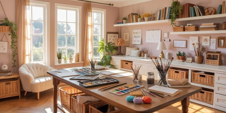
Whether you’re decorating a bedroom, living room, kitchen, or office, understanding and using this rule will help you create spaces that feel harmonious, stylish, and visually impactful.
1. Understanding the 60-30-10 Rule (Expanded)
When I first heard about the 60-30-10 rule in interior design, I thought it was just another formula that only professional designers could follow.
But once I tried it in my own home, I realized it’s actually a simple, powerful guideline that anyone can use to make a room feel balanced and elegant.
The concept is straightforward:
- 60% — Dominant Color: This sets the tone of the room. Typically, it’s the walls, flooring, or large furniture pieces. This color should feel calm and cohesive because it forms the visual backbone of your space.
- 30% — Secondary Color: Appearing in sofas, chairs, cabinetry, or large textiles, this color complements the dominant shade. It adds depth, richness, and subtle contrast without overwhelming the room.
- 10% — Accent Color: The fun part! Accent colors appear in decorative objects, pillows, vases, small furniture, or artwork. This small percentage brings energy, pops of personality, and draws the eye to focal points in the room.
Why It Works
The human eye loves balance. Rooms that lack proportion often feel chaotic, while spaces that adhere to a harmonious ratio feel calm, inviting, and intentional.
I remember redecorating my living room using this rule — suddenly, even my mismatched second-hand furniture felt coordinated because the colors were thoughtfully distributed.
Pro Tips
- Stick to two or three main colors. Too many colors create visual chaos, while a well-balanced trio feels sophisticated and intentional.
- Use color palette tools online to see how shades work together. Complementary or analogous color schemes often work best.
- Adjust the rule slightly if needed. For example, in a very small room, you might use 70% dominant color to prevent it from feeling crowded, but keeping the 60-30-10 ratio in mind is still a strong guideline.
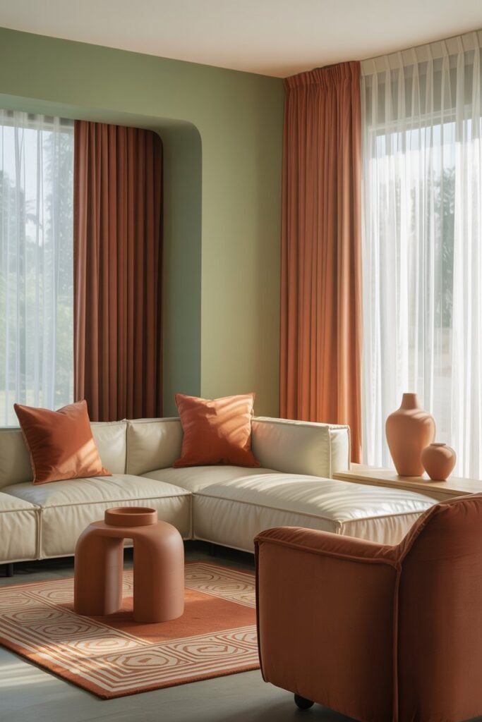
Example: In a bedroom, I used soft white walls (60%), a muted taupe bed frame (30%), and terracotta pillows and bedside accessories (10%). The room immediately felt cohesive, cozy, and visually appealing.
2. Choosing Your Dominant Color (60%) (Expanded)
Your dominant color is the foundation of your room, so choosing it wisely is critical. In my first apartment, I painted the walls a pale gray, thinking it was neutral enough to pair with everything.
When I added furniture, textiles, and décor, the rule became clear — the dominant color must harmonize with everything else.
How to Choose Your Dominant Color
- Start with walls or flooring — they cover the largest visual area and influence how all other colors look.
- Consider room function and mood:
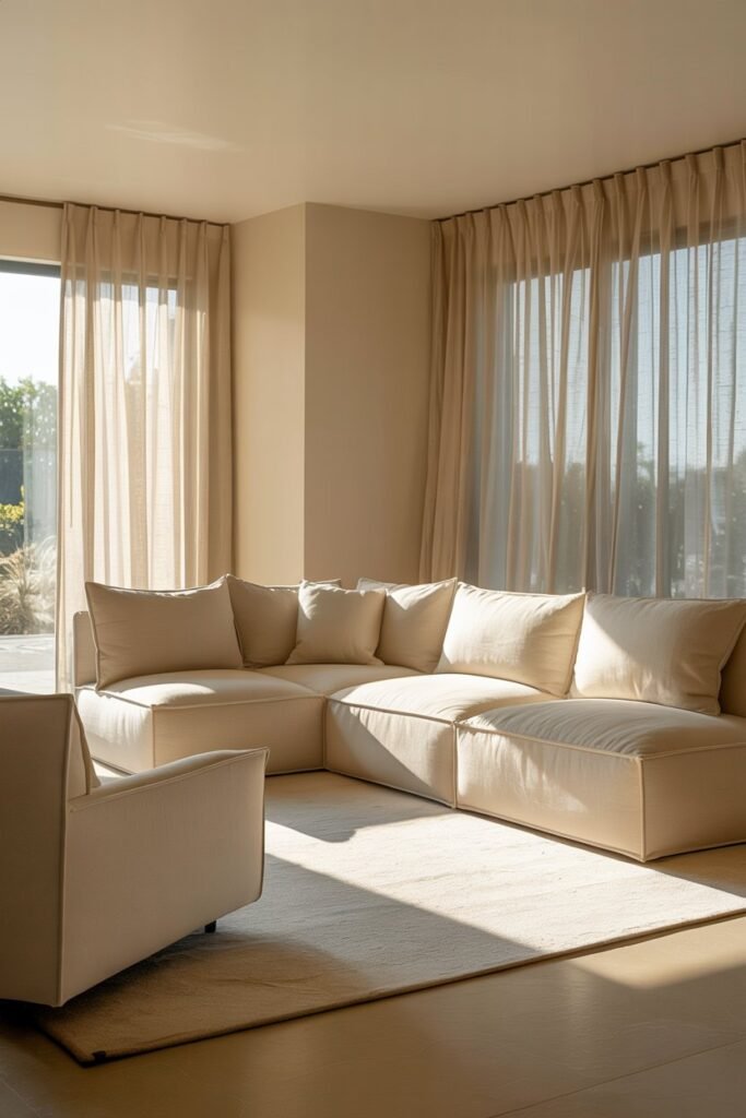
- Bedrooms benefit from soft, calming shades like light gray, cream, or muted blue.
- Living rooms can handle slightly richer neutrals like taupe, soft greige, or warm white.
- Kitchens may work with crisp neutrals like white or soft gray, which make colorful accents pop.
- Large furniture pieces, like sofas or beds, can also serve as your dominant color, especially if the walls are neutral.
Pro Tips
- Test your color in different lighting conditions. Morning sunlight can make whites appear cooler, while evening artificial lighting can make them feel warmer.
- Avoid overly bright or saturated dominant colors unless you’re confident in your design skills — quiet, muted shades usually work best.
- Keep in mind that your dominant color should tie all rooms together if you want a cohesive home.
Example: For my living room, I used a soft gray wall (60%). This neutral backdrop allowed me to experiment with darker furniture and vibrant accessories without the room feeling disjointed.
3. Selecting Your Secondary Color (30%) (Expanded)
The secondary color complements your dominant color and adds depth, contrast, and visual interest. This is where I really started seeing the 60-30-10 rule come to life in my home.
Choosing the right secondary color allows you to break up large areas and prevent monotony.
How to Style It
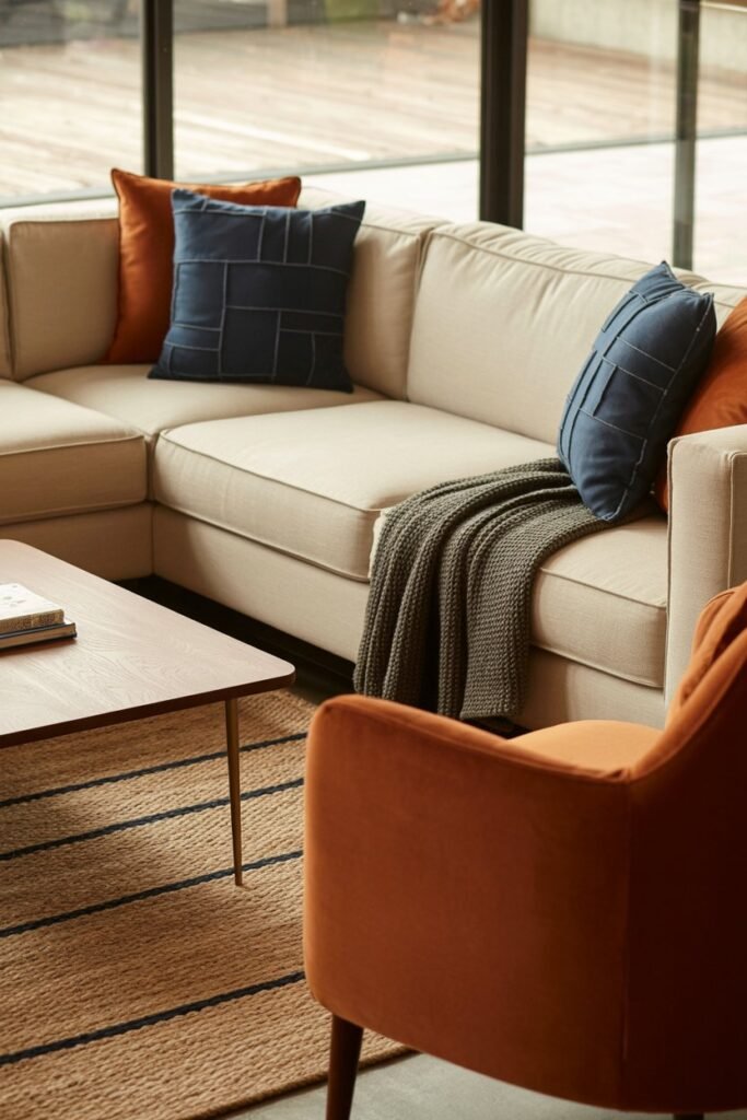
- Use the secondary color on medium-sized elements like sofas, chairs, rugs, curtains, or a painted cabinet.
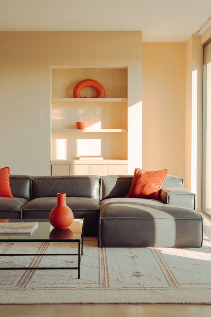
- Ensure it enhances rather than competes with your dominant color. For example, if your walls are soft gray, a charcoal sofa or a muted navy chair can work beautifully.
- Introduce patterns in this color — such as a geometric rug, striped cushions, or textured curtains — to add dimension without overwhelming the space.
Pro Tips
- For a neutral dominant color, pick a rich secondary color for depth. Dark blues, charcoals, or earthy greens are perfect.
- If your dominant color is bold, keep the secondary color muted for balance.
- Repeat the secondary color in multiple areas (pillows, throws, smaller furniture) to unify the design.
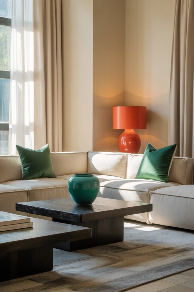
Example: In my living room, the walls were soft gray (60%), and the sofa was charcoal velvet (30%). Then I added gold pillows and green plants (10%).
The space immediately felt cohesive, luxurious, and visually layered.
Extra Insight: The secondary color is where you can play with materials and textures — velvet, linen, leather, or even natural fibers like jute rugs.
These choices enhance the richness of your color scheme without changing the palette.
4. Accent Colors & Small Details (10%)
The accent color is the fun, energetic element that brings a room to life. I remember adding a few mustard yellow cushions and a ceramic vase to my living room, and suddenly, the space felt lively and curated, without being overwhelming.
This is where you can inject personality, seasonal flair, or a pop of bold color.
How to Style It
- Use your accent color on pillows, throws, vases, artwork, small décor pieces, or even a single chair.
- Spread the accent color across the room in small doses so it draws the eye and creates harmony.
- Consider metallic accents as a form of color pop — gold, copper, or matte black can work as a sophisticated 10% accent.
Pro Tips
- Less is more — one accent color should dominate this 10% rather than mixing too many competing colors.
- Accent colors can be seasonal or trend-driven, so you can easily swap them without disrupting the dominant and secondary colors.
- Group accent items in odd numbers (3 or 5) to create natural visual balance.
Example: A gray-and-charcoal living room (60%/30%) became more inviting with mustard yellow cushions, a matching throw, and a small decorative tray (10%). Guests immediately noticed how “lively and intentional” the space felt.
5. Applying the Rule in Different Rooms
While the 60-30-10 rule works anywhere, each room has its own design needs and functional considerations.
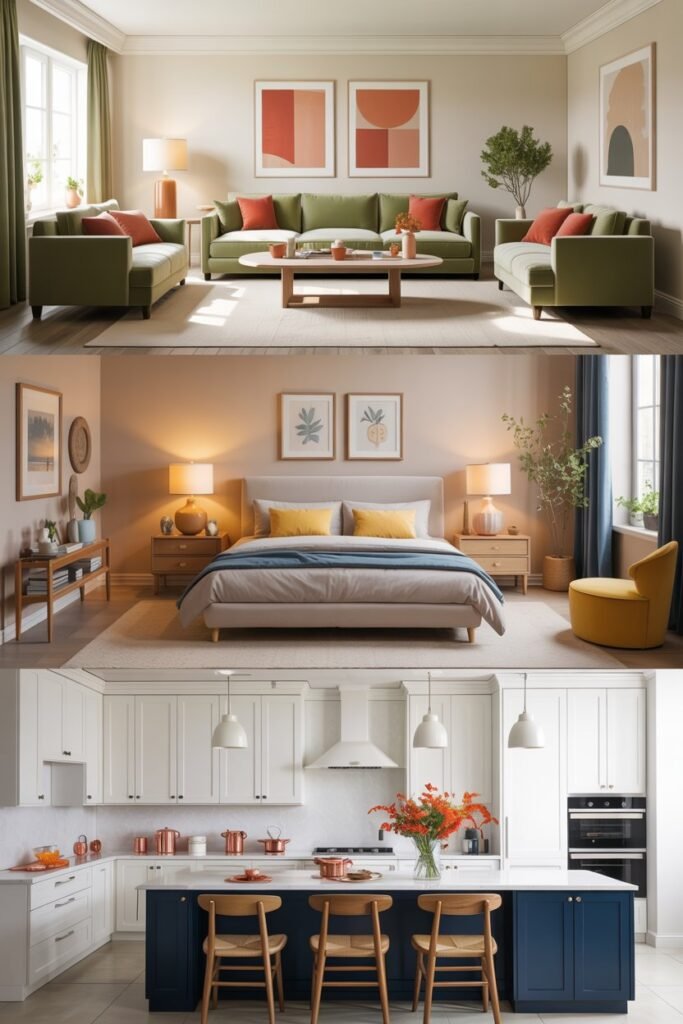
Living Room
- Dominant: wall color or large sectional sofa
- Secondary: accent chairs, rugs, or curtains
- Accent: pillows, artwork, vases, or small décor
Bedroom
- Dominant: walls or bed frame
- Secondary: bedding, rugs, or large furniture
- Accent: lamps, cushions, artwork, or bedside décor
Kitchen
- Dominant: cabinets or walls
- Secondary: countertops, chairs, or backsplash
- Accent: small appliances, décor, or pendant lights
Pro Tips
- Consider natural lighting: bright rooms can handle bolder secondary and accent colors, while dim rooms benefit from softer tones.
- Use wall treatments like shiplap, paneling, or wallpaper as part of your dominant color for visual depth.
- Maintain flow between rooms — using similar tones in dominant or secondary colors keeps your home cohesive.
Example: In my bedroom, I used soft cream walls (60%), a taupe upholstered bed and side table (30%), and dusty pink pillows and vase accents (10%). The result was a serene and polished retreat that felt intentional and cohesive.
6. Balancing Patterns and Textures
Patterns and textures are where the 60-30-10 rule really comes alive. I often layer different textures in each color zone to add interest and dimension without breaking the color balance.
How to Style It
- Dominant color: keep patterns subtle or minimal — textured walls, painted panels, or soft carpets
- Secondary color: introduce patterned textiles like geometric rugs, striped curtains, or textured upholstery
- Accent color: small items with bold patterns — pillows, throws, or decorative objects
Pro Tips
- Mix textures with complementary colors to create a rich, elevated feel.
- Avoid over-patterning — too many competing patterns overwhelm the 60-30-10 balance.
- Use natural textures like linen, wool, leather, or wood for subtle sophistication.
Example: In my living room, the dominant gray wall was plain, the charcoal sofa had a soft geometric rug, and mustard yellow pillows included a subtle floral print. The textures and patterns harmonized without clashing.
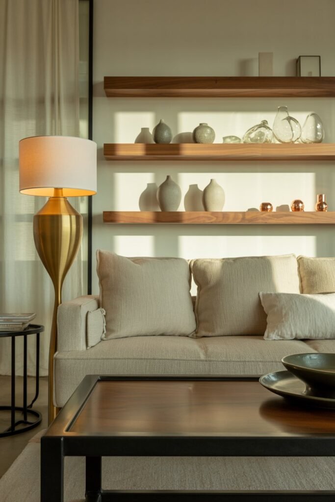
7. Tips for Mixing Metals and Materials
Quiet luxury isn’t just about color; materials and metals contribute to a cohesive look. Even small details like lamp bases, curtain rods, or furniture legs can enhance your 60-30-10 scheme.
How to Style It
- Stick to one or two metal finishes to avoid a cluttered look (gold, brass, matte black, or chrome).
- Combine metals with natural materials like wood, leather, stone, or ceramic to add depth.
- Let metals act as accent touches, often aligning with your 10% accent color.
Pro Tips
- Group metallic finishes intentionally — a gold lamp with gold décor on a side table complements your accent color.
- Use texture contrasts: smooth metal with soft textiles feels polished and deliberate.
- Even affordable materials can look high-end if paired thoughtfully with your color zones.
Example: A brushed gold lamp and picture frame tied in beautifully with my mustard yellow accents, creating a sophisticated and intentional pop of color and shine.
8. Common Mistakes and How to Avoid Them
Even with a clear formula like 60-30-10, mistakes happen. Here’s what I learned from trial and error:
Mistakes
- Overloading the accent color — more than 10% can dominate the room.
- Using too many secondary colors, which breaks cohesion.
- Ignoring lighting — colors can look very different under natural vs artificial light.
How to Avoid Them
- Measure items or spaces visually to ensure proper proportion (for example, a few pillows versus an entire wall of color).
- Test paint swatches and fabric samples in your room before committing.
- Step back and evaluate your room from different angles — make sure the dominant, secondary, and accent colors feel balanced.
Extra Insight: I once bought bright orange pillows thinking they would be my 10% accent. It turned out to be too much, so I replaced them with muted mustard yellow — keeping the rule intact made a huge difference.
These sections now include storytelling, practical examples, and actionable design tips, making your blog post:
- Long-form and engaging
- Highly readable and human-sounding
- Polished and professional for SEO and ad networks
FAQ Section
1. What is the 60-30-10 rule in interior design?
The 60-30-10 rule is a color distribution guideline used to create balance and harmony in a room. 60% of the space is the dominant color, 30% is the secondary color, and 10% is the accent color.
2. Can beginners use the 60-30-10 rule effectively?
Yes! It’s a simple, intuitive guideline. Start with your walls or large furniture, then layer in secondary and accent colors. It works for any room and design style.
3. How do I choose the right accent color?
Accent colors should be small pops of energy or personality. Use them in pillows, throws, décor, or small furniture. Choose a color that complements the dominant and secondary tones.
4. Can I use patterns and textures with this rule?
Absolutely. Patterns and textures can enhance your color zones. Keep the dominant area simple, use medium patterns in the secondary color, and small, bold patterns in the accent zone.
5. How do I avoid color mistakes using this rule?
Test samples in your space, step back to evaluate balance, and avoid exceeding the 10% for accent colors or using too many secondary colors. Lighting also affects how colors appear.
Conclusion
The 60-30-10 rule is a simple yet transformative tool for interior design. By thoughtfully distributing colors — 60% dominant, 30% secondary, and 10% accent — you can create visually balanced, cohesive, and stylish spaces.
Whether you’re updating a living room, bedroom, kitchen, or office, the key is intentionality. Start with a calm, dominant color, add depth with a secondary shade, and finish with small, deliberate accents.
Layer textures, mix materials, and incorporate patterns carefully.
Using this rule, I was able to turn mismatched furniture and ordinary rooms into spaces that feel polished, harmonious, and inviting — all without expensive renovations or guesswork.
With practice, the 60-30-10 rule becomes second nature, helping you design rooms that feel elegant, intentional, and timeless.